User Experience in IAM: Why UX Is a Security Control (2026)
In identity and access management, user experience is not a design nicety layered on top of security — it is the variable that decides whether your controls get used or quietly routed around. The 2026 practitioner guide to why friction drives workarounds, where UX breaks across the identity lifecycle, how to measure it, and the UX-versus-security tradeoff done right.

In identity and access management, user experience is not a design nicety layered on top of security — it is the variable that decides whether your controls get used or quietly routed around. The 2026 practitioner guide to why friction drives workarounds, where UX breaks across the identity lifecycle, how to measure it, and the UX-versus-security tradeoff done right.
- User experience in IAM is a security control, not a cosmetic layer. When the sanctioned path is slow or confusing, people route around it — shared accounts, disabled MFA, credentials in spreadsheets, shadow SaaS — and every workaround is a control that exists on paper and fails in production.
- UX is not one screen. It breaks at five distinct moments in the identity lifecycle: onboarding and enrollment, login and SSO, self-service reset, access requests, and recertification. A failure at any one moment pushes users off the governed path, and the weakest moment is where the leak happens.
- The UX-versus-security tradeoff is mostly false. The strongest modern controls — passkeys, risk-based step-up, self-service reset, short contextual review queues — are simultaneously lower-friction and higher-assurance. Real tradeoffs exist at the margins, but treating friction as proof of security is a design failure.
- IAM UX is measurable. Instrument four signals — time-to-sign-in, prompt frequency, help-desk contact rate, and enrollment coverage — segment them by population, and you can see friction accruing before users route around it.
- Good UX does not replace strong authentication, governance, or an honest identity data foundation. It determines whether those controls are adopted; it does not make weak ones safe. UX is a force multiplier on a sound program, not a substitute for one.
User experience matters in IAM because it decides whether your security controls are actually used or quietly routed around. When the sanctioned path — enrolling in MFA, signing in, resetting a password, requesting access — is slow, confusing, or punishing, people invent faster paths: shared logins, disabled second factors, credentials in a spreadsheet, unsanctioned SaaS. Every one of those workarounds is a control that exists on paper and fails in production, and most of them sit outside your audit trail entirely. So UX in IAM is not a design nicety layered on top of security. It is the variable that determines whether the security you bought becomes the security you actually have.
This is the 2026 update of our original piece on recognizing user experience in IAM, rewritten around a sharper thesis than "balance usability with security." In the current landscape — where the modern intrusion opens with a credential rather than an exploit — UX is a security control, adoption is the mechanism, and measuring the experience belongs on the same dashboard as your other controls. This piece is practitioner-grade: what "good IAM UX" means at each stage of the identity lifecycle, why the usability-versus-security tradeoff is mostly false, how to measure the experience, how to design for the deviceless frontline, and — honestly — what good UX does not solve. For the wider program context, our complete enterprise IAM security guide is the horizontal these UX specifics sit inside.
User Experience Is a Security Outcome, Not a Nicety
Start with the mechanism, because the whole argument rests on it. Every identity control assumes a user will follow a prescribed path. MFA assumes people enroll and keep their factors. Least-privilege access assumes people request access through the governed channel. Credential hygiene assumes people use their own account and never write the password down. Each of those assumptions is a bet on user behavior, and behavior is governed by effort. When the effort of the sanctioned path exceeds the perceived value of following it, the rational user does not comply harder — they route around.
That routing-around is where friction converts directly into exposure. A twelve-step MFA enrollment does not produce more secure users; it produces unenrolled users and a help desk that grants exceptions. A login that times out mid-task does not protect the session; it produces a shared credential taped under a keyboard. A password reset locked behind a help-desk queue does not harden recovery; it produces passwords in a notes app and a social-engineering surface at the service desk. An access request that takes two weeks does not enforce least privilege; it produces Slack DMs to admins and personal-tier SaaS subscriptions that no one governs. Friction and workaround are the two ends of one lever.
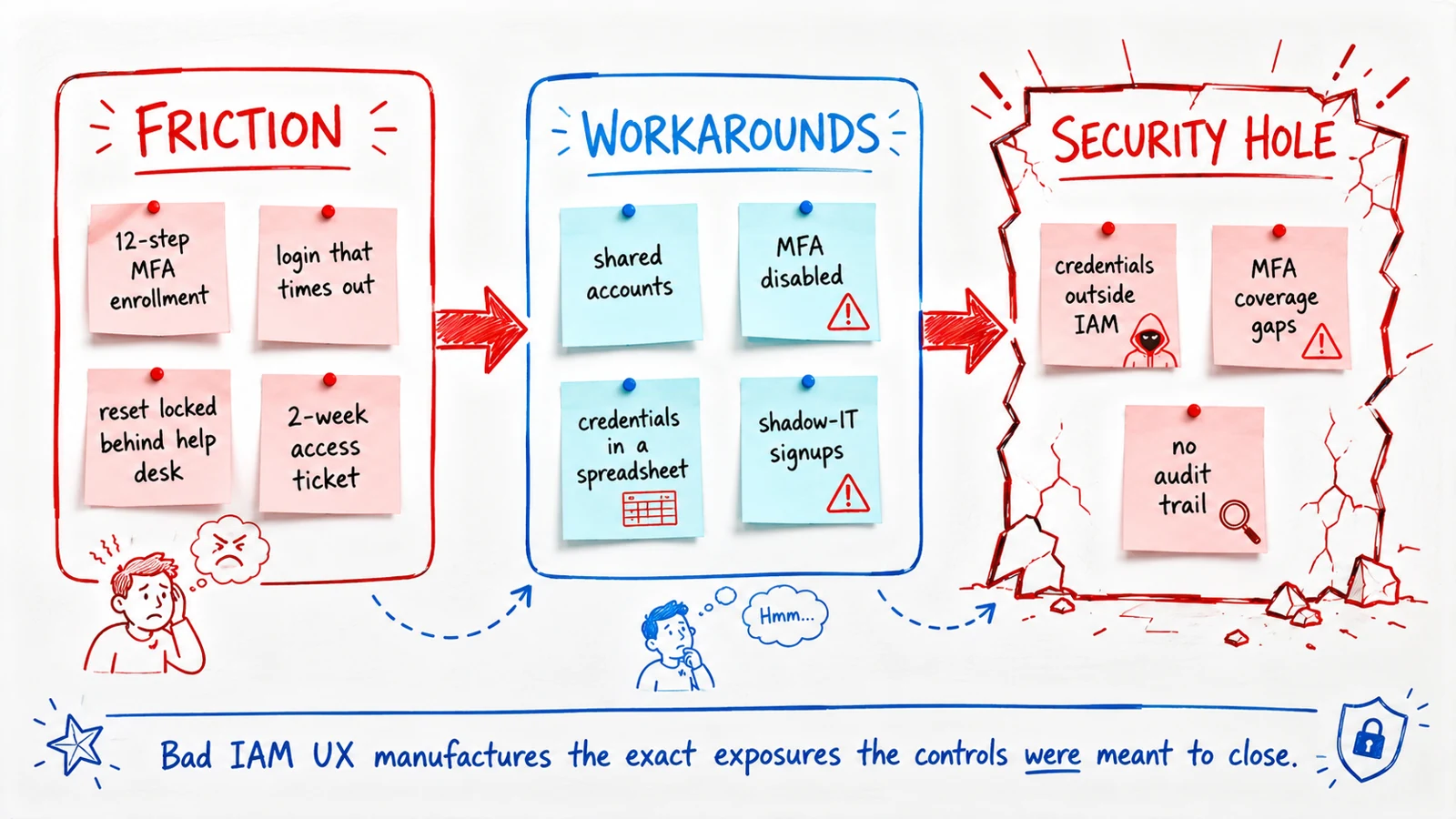 Bad IAM UX does not just annoy users — it manufactures the exact exposures the controls were meant to close.
This reframes UX from a satisfaction metric into a risk metric. The question is not "do users like the login screen." The question is "what is the effective adoption rate of each control, and where is the population that has quietly opted out." Credential misuse features in a majority of breach reports per current industry consensus, and the credentials that get abused are disproportionately the ones living outside the governed system — the shared account, the never-enrolled frontline login, the reset workaround. Bad UX is not adjacent to those exposures. Bad UX is the production line that makes them.
Where IAM UX Breaks Across the Identity Lifecycle
"IAM UX" is not a single screen you can polish. It is a sequence of distinct moments, each with its own failure mode, and a program can nail four of them and still leak through the fifth. Mapping the experience across the lifecycle is the first move toward measuring and fixing it.
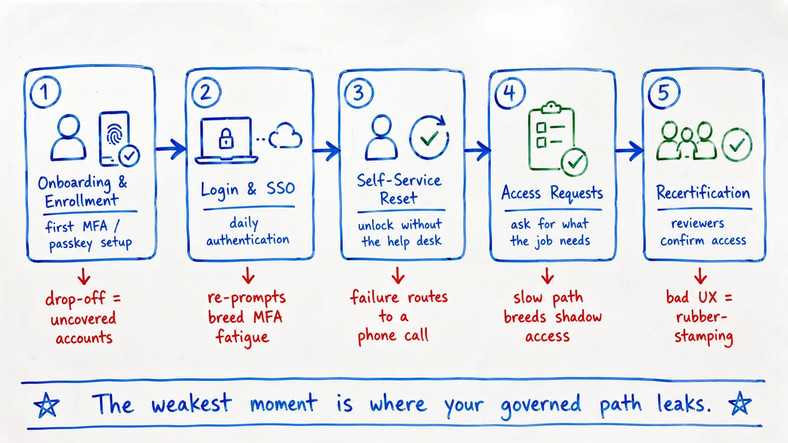 Map UX across all five lifecycle moments — the weakest stage is where users drop off the governed path and the leak begins.
Onboarding and enrollment. This is the first impression and the coverage-defining moment. If enrolling a passkey or second factor is slow, confusing, or assumes hardware the user does not have, enrollment drops off — and every un-enrolled identity is an account protected only by a password. Enrollment UX is where MFA coverage is actually won or lost, and the gap almost always concentrates in the populations the enrollment flow was not designed for.
Login and SSO. The highest-frequency interaction in the entire stack, so small friction compounds enormously. The failure mode here is not weak authentication — it is over-prompting. Challenge users on every action regardless of risk and you manufacture MFA fatigue, which is precisely the condition that prompt-bombing attacks exploit. Single sign-on plus risk-based step-up — challenge when risk is elevated, stay quiet when it is not — is both the better experience and the stronger control. The direction of travel here is passwordless login, which removes the shared secret that made the tradeoff painful in the first place.
Self-service reset. Password reset and account unlock are the classic help-desk cost center and a genuine security surface — the service desk is one of the most reliably social-engineered points in the enterprise. Self-service that actually resolves the user's problem removes both the cost and the attack vector at once. Self-service that fails halfway and dumps the user into a phone queue does neither. The design details that separate the two are the subject of our self-service password reset deployment guide.
Access requests. Every request is a moment where the governed path competes directly with the ungoverned one. If asking for access the correct way returns a decision in minutes, users use it. If it means a two-week ticket ping-pong, they find an admin who will grant it informally, or they buy a personal SaaS seat and move the data there. The request experience is quite literally the enforcement mechanism for least privilege — when the sanctioned path is slower than the shortcut, least privilege becomes optional.
Recertification. The reviewer is a user too, and reviewer UX determines whether governance produces decisions or theater. Hand a manager hundreds of raw entitlement strings with no context and a deadline, and approve-all becomes the rational response — the rubber stamp is a queue-design failure, not a character flaw. Short, risk-scored, contextual review queues produce real revocations; line-item dumps produce green dashboards and unchanged risk. This is a core theme of modern access governance: governance fails on friction just like authentication does.
The UX-Versus-Security Tradeoff Is Mostly False
The oldest framing in this space treats usability and security as a seesaw: every increase in one costs the other. That framing was never quite right and in 2026 it is mostly wrong, because the strongest controls available are also the lowest-friction ones.
Passkeys are the clearest example. A passkey is phishing-resistant, credential-stuffing-immune, and FIDO2-compatible — and it is also faster and easier than typing a password, because the user just approves with a biometric. That is higher assurance and lower friction in the same control. Risk-based authentication is another: it reduces prompts for low-risk sessions while tightening high-risk ones, so the average user is interrupted less while the risky session is interrupted more. Self-service reset removes a support cost and a social-engineering vector simultaneously. Single sign-on cuts the number of credentials a user manages, which reduces both password fatigue and the reused-password blast radius. In every one of these cases, the better experience is the more secure design.
Where does a real tradeoff live? At the margins, and deliberately. Stepping up to a high-assurance challenge before a privileged, irreversible action is genuinely more effortful — and it should be, because the assurance is worth the friction there. The discipline is to spend friction where it buys assurance and nowhere else. The failure is the inverse: treating friction as evidence of security, and imposing blanket effort that produces no additional assurance and plenty of workarounds. Friction that generates no assurance is pure cost, and its dividend is paid in shared accounts and disabled factors. "Secure because it is annoying" is not a control posture; it is a design that has confused the pain with the protection.
How to Measure IAM UX
Everything above is unfalsifiable until you instrument it. "Users find it easy" is an assertion; time-to-sign-in is a number. The good news is that IAM UX is highly measurable, and four signals carry most of the value.
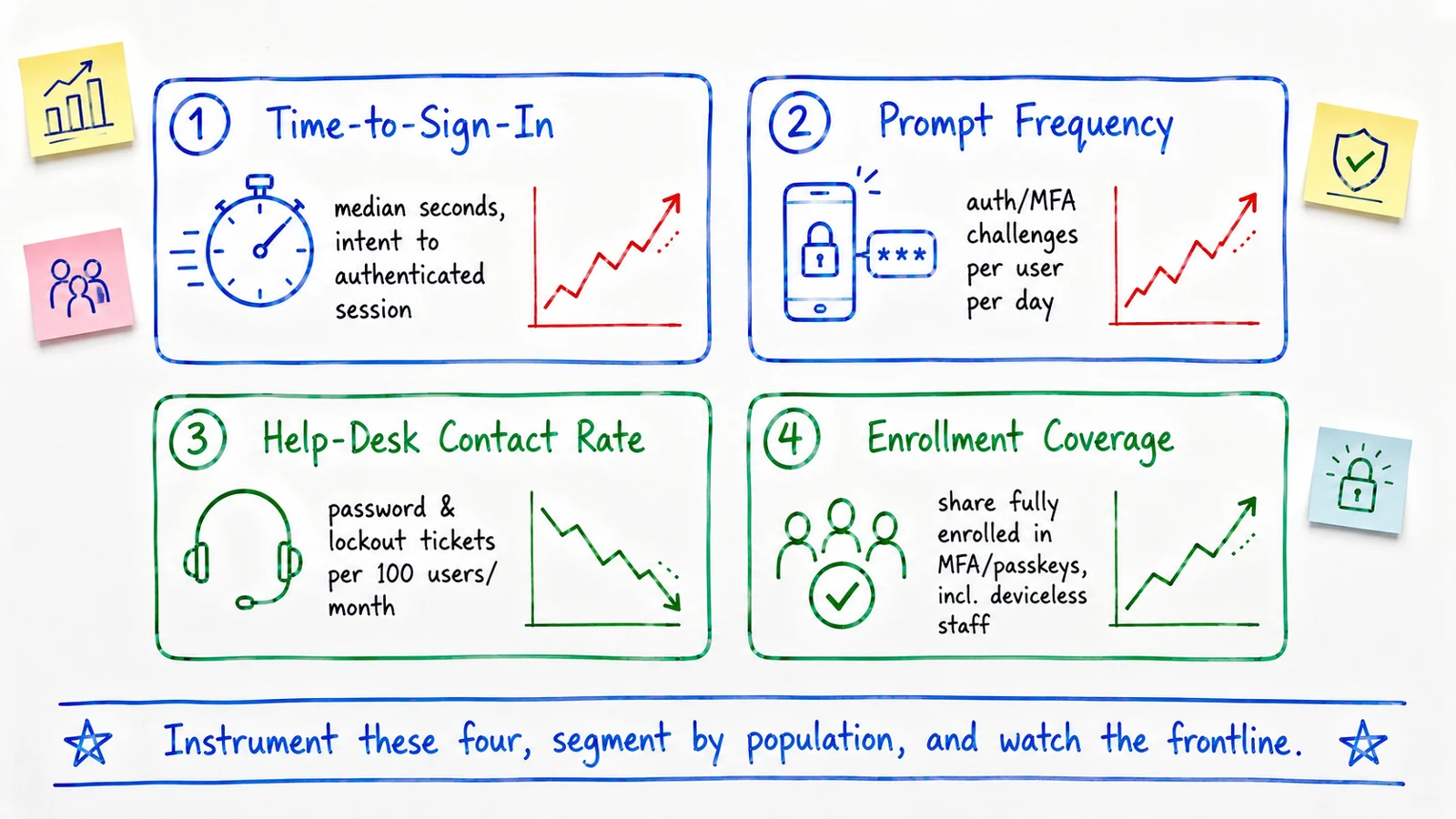 Instrument these four, segment by population, and watch the frontline — that is where UX debt hides.
Time-to-sign-in is the median time from intent to an authenticated session, tracked per application and per population. A rising trend is friction accruing in real time, usually before anyone files a complaint. Prompt frequency — auth and MFA challenges per user per day — is your MFA-fatigue meter; high counts predict both user frustration and susceptibility to approval-reflex attacks. Help-desk contact rate — password and lockout tickets per hundred users per month — is the most honest measure of whether self-service actually works, because it counts the failures that fell through to a human. Enrollment coverage — the share of the workforce fully enrolled in strong authentication — is the one that most often hides a problem behind a healthy-looking headline.
The technique that makes these signals useful is segmentation. An 85% MFA enrollment number can conceal a frontline site sitting at 15%. A good median time-to-sign-in can hide one legacy application where authentication is miserable. Break every metric out by department, site, application, and worker type, and the aggregate stops lying to you. These UX signals also map cleanly onto a maturity view — where an organization sits on the identity maturity model correlates strongly with whether it measures the experience at all — and they belong in the same reporting frame as your broader security culture KPIs, because adoption of a control is a cultural and experiential outcome, not just a technical one.
Designing for the Deviceless and Frontline Population
Most IAM UX is implicitly designed for a knowledge worker with a company laptop and a personal smartphone. A large share of the workforce does not match that profile — manufacturing floors, retail associates, clinical staff, warehouse and logistics teams, field technicians. Many have no assigned computer, no company phone, and share kiosks or terminals. For this population, the default "we'll push a prompt to your phone" pattern does not degrade gracefully; it fails outright.
This is where enrollment coverage quietly collapses. The knowledge-worker population enrolls smoothly and the dashboard looks healthy, while the deviceless population — often the largest headcount and frequently the one with physical access to sensitive operations — sits unenrolled and password-only. That is not a rounding error. It is a concentration of exactly the credential-compromise risk the program exists to reduce, parked in the segment the UX never accounted for.
Designing for it means treating deviceless authentication as a primary requirement rather than an exception: fast personal unlock on shared kiosks, physical or card-based factors, PIN-plus-possession models, and challenge flows that never assume a personal device. Avatier's work on removing the smartphone dependency for frontline identity — the deviceless "green path" behind the Identity Challenge Card — exists precisely because a security model that only covers the people who carry a corporate phone is a security model with a large, predictable hole in it. The practical test is simple: track frontline enrollment coverage as its own metric, and if it lags the knowledge-worker number, your UX has a population it forgot.
What Avatier Ships Toward This Pattern
Avatier's position on all of the above is opinionated in one direction: friction is a security risk, so the end-user and reviewer experience is treated as a first-class engineering problem, not a skin over the login. Avatier Identity Anywhere is built around the lifecycle moments above — passkey and MFA enrollment designed for coverage including deviceless staff, single sign-on with risk-based step-up to cut prompt volume, genuine self-service password reset and unlock that resolves without a help-desk call, self-service access requests with policy checks that return fast decisions, and recertification built around short risk-scored contextual queues instead of line-item dumps. The design intent throughout is to make the secure path the easiest path, so that adoption — and therefore the control — actually holds.
That the platform is engineered for low friction does not lower the assurance bar, and the compliance posture behind it is published rather than asserted. Avatier's is public at the Avatier Trust Center: SOC 2 Type II audited with zero exceptions noted, ISO/IEC 27001:2022 certified, PCI DSS v4.0.1 compliant, CSA STAR Level 1 attestation, NIST 800-53 Rev. 5 aligned, FedRAMP-aligned, and a signatory of the CISA Secure-by-Design Pledge. The through-line between that posture and this article is the same one this whole piece argues: assurance and experience are not opposites, and the platforms that win the next several years are the ones that stopped treating them as a tradeoff.
What Good UX Does Not Solve
An honest piece ends at the limits, because UX sold as a cure-all gets blamed for failures it was never scoped to prevent — and it earns a backlash it does not deserve.
Good UX does not replace strong authentication. A delightful login flow protecting a phishable password is a pleasant door with a broken lock. UX drives adoption of strong authentication; it is not a substitute for having it. Good UX does not replace governance. Making access requests fast and reviews painless raises the odds that governance decisions are real, but the discipline of deciding who should hold what access is its own program — smooth UX on top of no governance just accelerates ungoverned access. Good UX does not fix a broken identity data foundation. If HR data is wrong and ownership mappings are stale, a beautiful interface will simply help users navigate incorrect access faster. Data quality sits upstream of every experience in this article.
And good UX does not eliminate every tradeoff. Some high-assurance actions should be effortful, and a program that optimizes purely for the smoothest possible path will under-protect the moments that warrant friction. The goal is not zero friction. The goal is intentional friction — effort spent exactly where it buys assurance, and removed everywhere it only buys workarounds.
That is the whole discipline in one line: make the secure path the easiest path, spend friction only where it earns assurance, and measure the experience so you can see the leaks before your users route around them. In 2026, an IAM program that does that is not choosing usability over security. It is choosing the security that actually gets used.
ABOUT THE AUTHOR

More from IAM & Identity Governance

CIAM: Customer Identity and Access Management in 2026
What CIAM actually is, what it has to handle that workforce IAM never does, the four building blocks that make it work, and the constant balancing act between a login your customers will tolerate and one an attacker cannot walk through.

Zero Trust Identity Architecture: The 2026 Foundational Guide
Zero trust for identity means never trusting a request by default and verifying every one against live signals — identity, device posture, location, and risk. The foundational 2026 reference on what that actually requires.

Hybrid Active Directory and Entra ID: Governing Both as One
Most enterprises run on-premises Active Directory and Microsoft Entra ID at the same time, bridged by identity synchronization. This is the 2026 reference on why the hybrid estate exists, where the sync bridge fails — duplicate identities, sync gaps, conflicting policy, password and hash drift — and the path to inventorying both directories, syncing or federating them, unifying policy, and governing the whole estate as one.